work


schuh
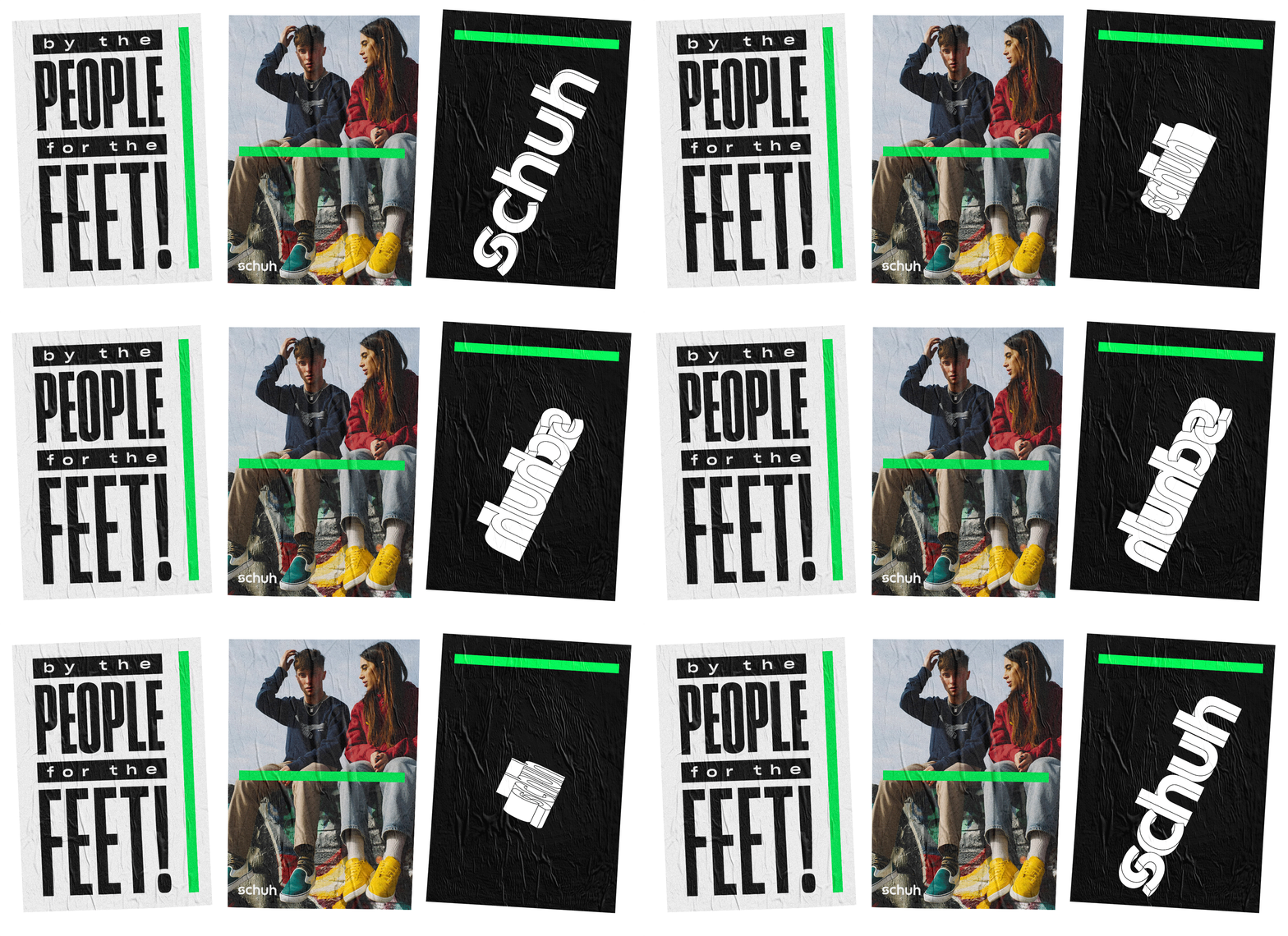
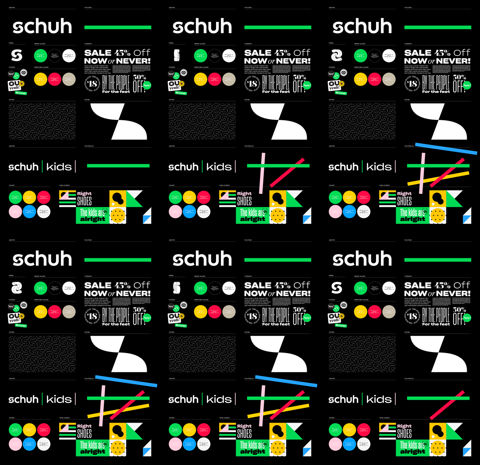
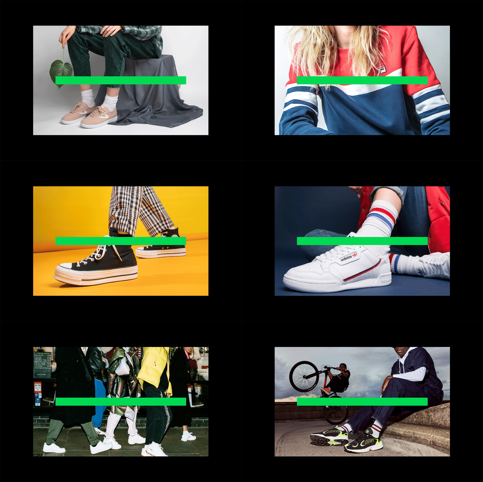
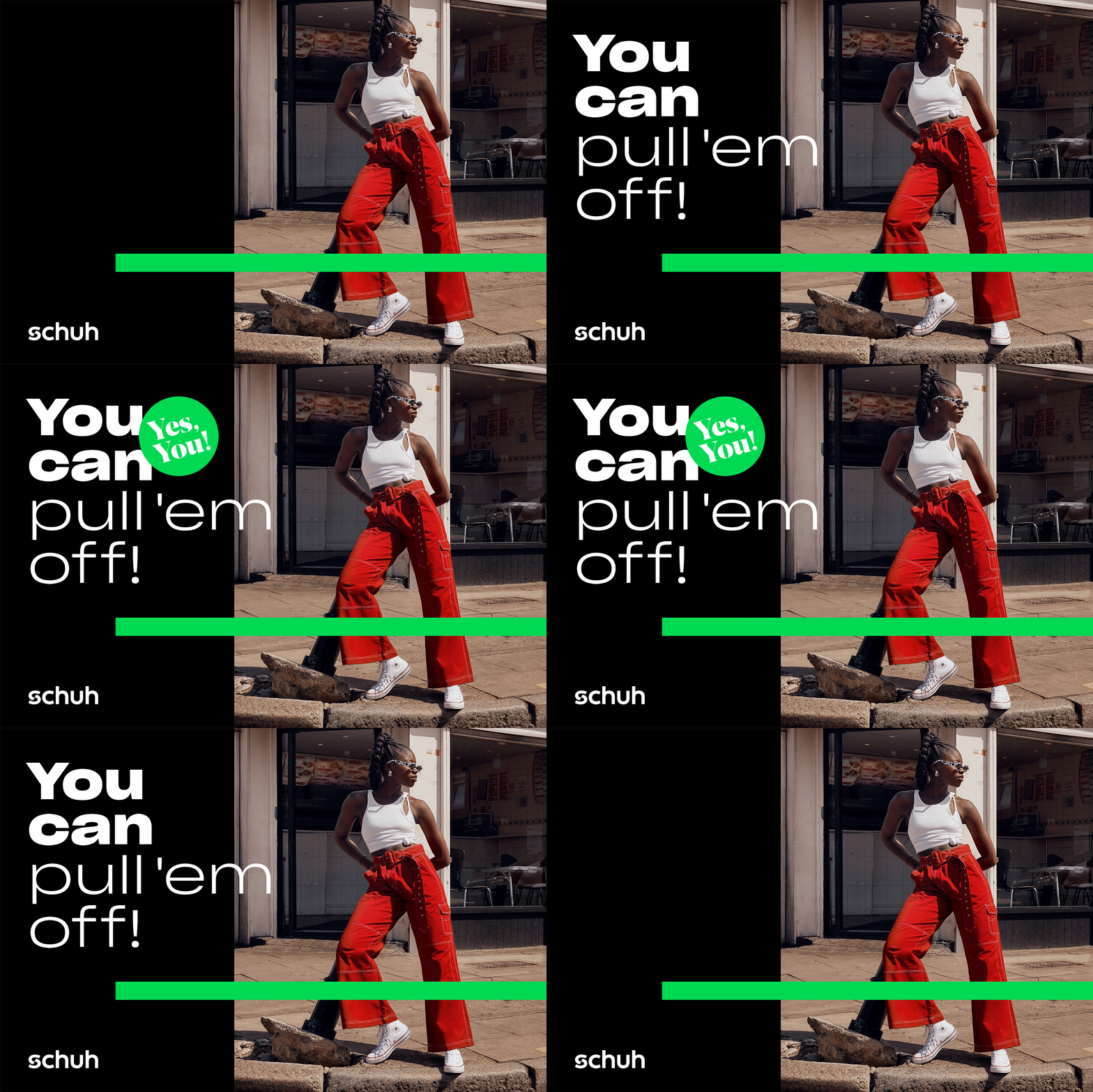
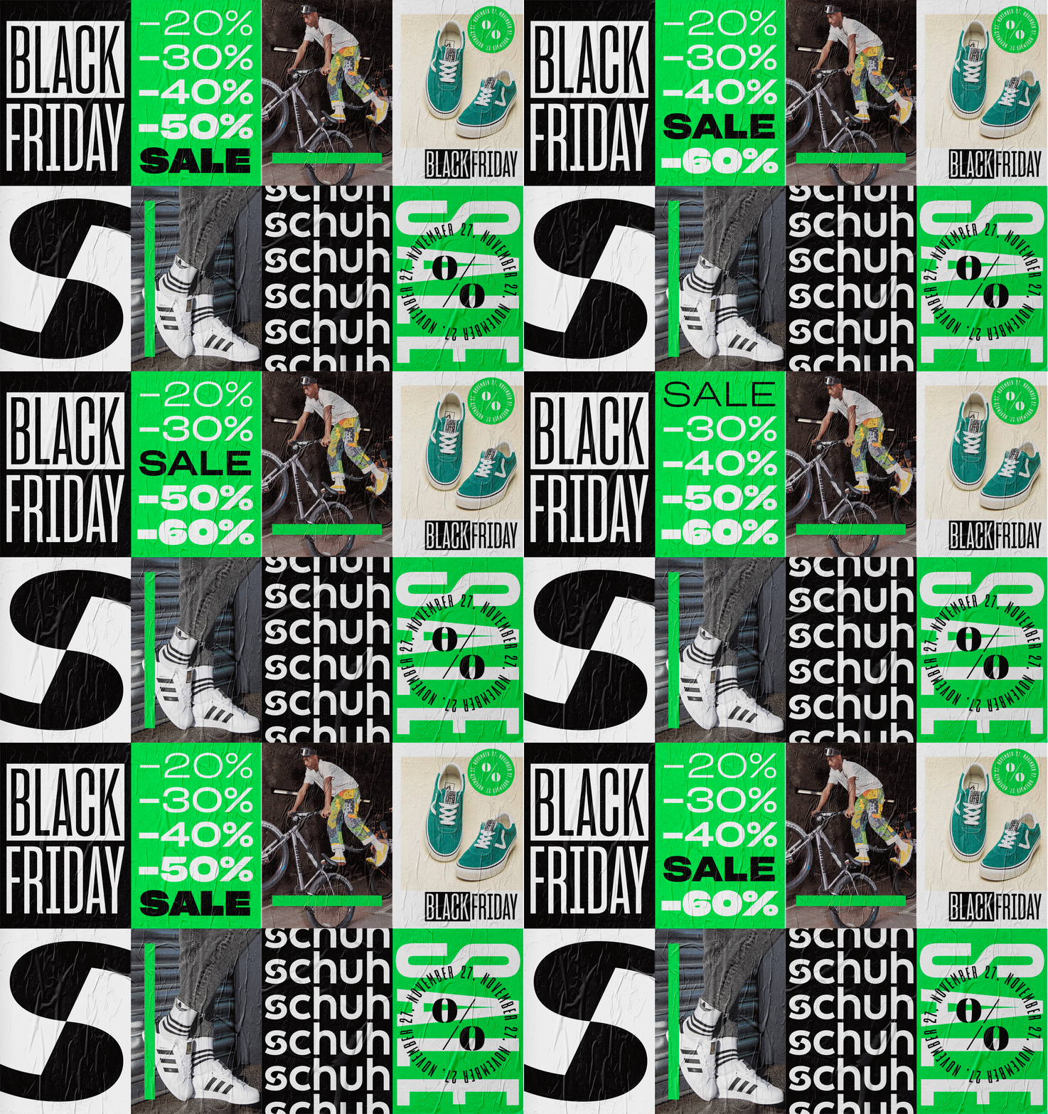
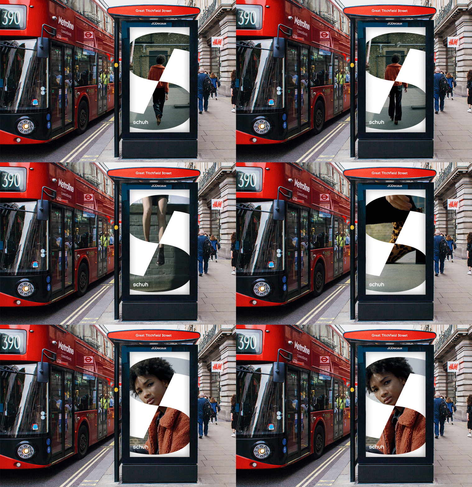
We found out that their USP had shifter from stocking cool products into the excellent service their people gave customers. We changed the brand communication from talking about products to talking about the company's values and the people behind the brand as well as the people in the shoes, the customers. We refreshed the old logotype, intensified their green to become more modern and added a much more versatile colour palette as well as an entirely new typeface that had a much more flexible range and attractive design. We added a green stripe to serve as a brand symbol across all channels. The new store fits have already started to roll out and "people first" has always been in schuh's veins it's just that now it finally shows and includes both staffs as well as customers and you!